This WCAG 2.2 checklist is written for people who run a WordPress site, not for developers. It turns the guidelines into plain checks you can work through from your dashboard and your browser.
You do not need to read code to use it. You need a keyboard, a free browser extension or two, and some patience.
If you want to make your WordPress site accessible, start here. We also cover what changed in WCAG 2.2, how to test your pages, and what a toolbar can do.
What is WCAG 2.2?
WCAG stands for Web Content Accessibility Guidelines. It is the standard most organisations use to judge whether a website works for disabled people. WCAG 2.2 became a W3C Recommendation on 5 October 2023.
The guidelines are organised under four principles, often shortened to POUR:
- Perceivable. People can see or hear your content, or get it another way, such as alt text or captions.
- Operable. People can use your site with a keyboard, a touchscreen, a switch or voice control.
- Understandable. Your content and your forms behave in ways people can predict and follow.
- Robust. Your site works with different browsers and assistive technology, such as screen readers.
Each requirement is called a success criterion, and each one has a level: A, AA or AAA. Level A is the minimum. Level AAA is the strictest and is not realistic for every page.
Most laws and policies point to AA, so WCAG 2.2 AA is the sensible target. That means meeting every A and AA criterion.
Rules differ by country. UK public sector guidance uses WCAG 2.2 AA. The US ADA Title II rule for state and local government uses WCAG 2.1 AA. The EU relies on a standard called EN 301 549.
Check which version your rules name. This article is practical guidance, not legal advice.
What’s new in WCAG 2.2
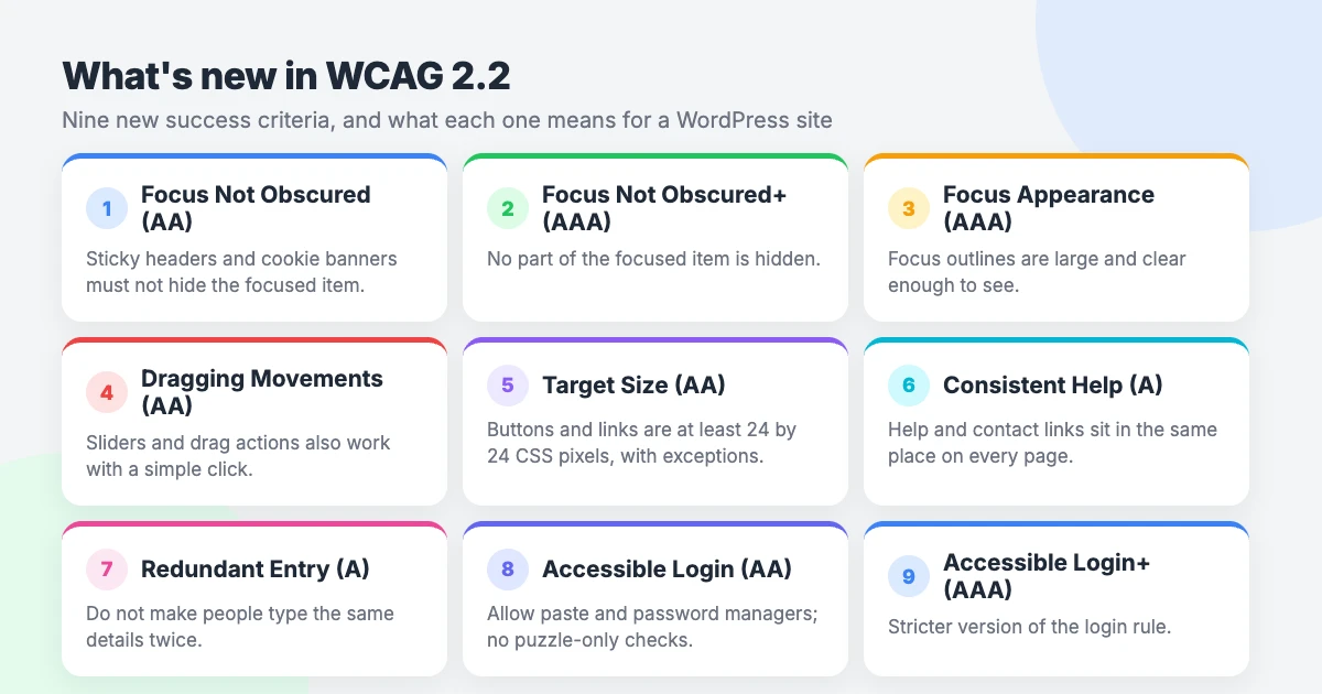
WCAG 2.2 adds nine success criteria to the previous version. The W3C explains each one on its What’s new in WCAG 2.2 page. Here is what they mean for a WordPress site.
| Criterion | Level | What it means for a WordPress site |
|---|---|---|
| 2.4.11 Focus Not Obscured (Minimum) | AA | When someone tabs to a link or button, it must not be completely hidden by a sticky header, cookie banner or chat widget. |
| 2.4.12 Focus Not Obscured (Enhanced) | AAA | The stricter version: no part of the focused item is hidden. |
| 2.4.13 Focus Appearance | AAA | The focus outline is thick enough and has enough contrast to be easy to see. |
| 2.5.7 Dragging Movements | AA | Anything that works by dragging, such as a slider or a sortable list, also works with a simple click or tap. |
| 2.5.8 Target Size (Minimum) | AA | Buttons and icons are at least 24 by 24 CSS pixels. There are exceptions, such as targets with enough spacing and inline links in text. |
| 3.2.6 Consistent Help | A | If you offer help, such as a contact link or chat, it appears in the same place on every page. |
| 3.3.7 Redundant Entry | A | Forms do not ask people to type the same information twice in one process. |
| 3.3.8 Accessible Authentication (Minimum) | AA | Logging in does not depend on memory tests or puzzles. Pasting and password managers are allowed. |
| 3.3.9 Accessible Authentication (Enhanced) | AAA | The stricter version, with fewer exceptions for login tests. |
One criterion was removed. 4.1.1 Parsing is obsolete in WCAG 2.2, because modern browsers and assistive technology handle markup errors far better than they used to.
If you aim for AA, you can set the three AAA criteria aside for now. The A and AA criteria all apply to you.
The WCAG 2.2 checklist for WordPress
Work through this WordPress accessibility checklist one area at a time. A WCAG 2.2 WordPress review covers your theme, your content and your plugins.
It is a practical summary, not a replacement for the full guidelines. Treat it as your starting point.
Theme and layout
- Start with an accessible theme. Your theme controls headings, menus, focus styles and colours, so it sets the baseline. See our roundup of accessible WordPress themes.
- Check for a skip link. Press Tab once on any page. A “Skip to content” link should appear.
- Check the layout on a phone. Content should fit the screen without sideways scrolling.
- Set the site language. Choose the correct language in Settings » General so screen readers pronounce your content properly.
Navigation and keyboard
- Everything works with a keyboard. You can reach every menu item, link, button and form field with Tab, and activate it with Enter or Space.
- Focus is always visible. A clear outline shows which item is selected. Never remove it for the sake of design.
- Focus is not hidden (2.4.11). Sticky headers, cookie banners and chat bubbles must not cover the item you have tabbed to.
- The tab order makes sense. Focus moves in the same order as the page reads.
- Dropdown menus open without a mouse. Submenus open from the keyboard and close with Escape.
Images and media
- Add alt text to meaningful images. Describe what the image shows or does. The block editor has an alt text field in the image settings.
- Leave alt text empty for decoration. Purely decorative images do not need a description.
- Caption your videos. Captions help deaf visitors and anyone watching without sound.
- Provide transcripts for audio. Podcasts and audio clips need a text version.
- Do not autoplay. Sound or video that starts by itself is disorienting. Let visitors press play, and make sure they can pause.
Headings and content structure
- Use one clear page title. In most themes the post title is the main heading, so start your content at H2.
- Keep heading levels in order. Do not jump from H2 to H4 because you prefer the size.
- Check the outline. Open the Document overview in the block editor to see your heading structure at a glance.
- Use real lists and tables. Use the List and Table blocks instead of typing dashes or lining text up with spaces.
- Write in plain language. Short sentences and familiar words help everyone.
Colour and contrast
- Check text contrast. AA needs a ratio of at least 4.5:1 for normal text and 3:1 for large text.
- Check buttons, icons and form borders. Interface components and meaningful graphics need at least 3:1 against their background.
- Do not rely on colour alone. Underline links in body text, and add an icon or words to error messages.
- Watch text over images. Hero banners with text on a photo often fail. Add a dark overlay or a solid background.
Links and buttons
- Write descriptive link text. “Read our pricing guide” tells people where they are going. “Click here” does not.
- Make targets big enough (2.5.8). Buttons, social icons and menu toggles should be at least 24 by 24 CSS pixels, or well spaced apart.
- Label icon-only buttons. Search, menu and close icons need a text name that screen readers can announce.
- Warn about new tabs. If a link opens a new tab, say so in the link text.
Forms and login
- Give every field a visible label. Placeholder text disappears when someone starts typing, so it is not a label.
- Explain errors in words. Say which field is wrong and how to fix it.
- Do not ask twice (3.3.7). In a checkout or multi-step form, offer “same as billing address” rather than making people retype it.
- Keep login simple (3.3.8). Allow pasting into password fields and do not block password managers.
- Avoid puzzle CAPTCHAs. If you must use one, offer an alternative that does not depend on solving a puzzle.
Help and contact
- Keep help in the same place (3.2.6). If you show a contact link, phone number or chat button, put it in the same spot on every page.
- Offer more than one way to get in touch. Some people cannot use a phone, and others struggle with forms.
Dragging
- Give sliders button alternatives (2.5.7). Carousels should have previous and next buttons, not only swipe or drag.
- Check other drag features. Range sliders, before-and-after image comparisons and sortable lists need a click or tap option too.
Plugins
- Test what your plugins add. Page builders, sliders and popups add their own markup, and your theme cannot fix it.
- Check popups carefully. A popup should move focus into itself, close with Escape, and return focus when it closes.
- Retest after updates. A plugin update can change how a feature behaves.
How to test your WordPress site
No single tool tells you whether a site meets WCAG 2.2 AA. Automated tools catch only some issues, so combine them with manual checks.
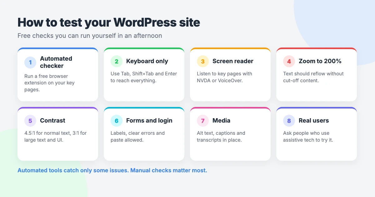
Pick a handful of key pages: your homepage, a post, a contact page and your checkout or login. Then run the WCAG 2.2 checklist against each one using these steps.
- Run an automated checker. Browser-based tools such as WAVE and the axe DevTools extension have free versions. They flag missing alt text, empty links and contrast problems.
- Try a keyboard-only test. Put your mouse aside and use Tab, Shift+Tab, Enter, Space and Escape. Note anything you cannot reach, see or close.
- Do a screen reader spot-check. NVDA is free for Windows, and VoiceOver is built into Apple devices. Listen to your menu, a post and a form.
- Zoom to 200%. Text should grow and reflow without overlapping, cutting off or forcing sideways scrolling.
- Check contrast. Enter your text and background colours into WebAIM’s free contrast checker.
- Test your forms. Submit each one empty and with mistakes. Check that the errors are clear and that focus moves to them.
- Ask real users. Feedback from disabled people who use assistive technology every day will tell you more than any tool.
WordPress has a Site Health screen under Tools, but it covers performance and security. It does not check accessibility.
Common WordPress accessibility problems (and fixes)
- Missing alt text. Open the Media Library and add descriptions, then check images already placed in posts.
- Low-contrast text. Pale grey text on white is a frequent cause. Darken it in your theme’s colour settings.
- Headings chosen for size. Change the heading level to fit the structure, then adjust the size in the block’s typography settings.
- Vague links. Rewrite “Read more” and “Click here” so each link makes sense out of context.
- Focus outline removed. If custom CSS hides the outline, delete that rule or replace it with a visible style.
- Sticky header covering focus. Reduce the header height, or ask a developer to add scroll padding so focused items stay in view.
- Carousels that move by themselves. Turn off autoplay, or add a pause button and visible previous and next controls.
- Unlabelled form fields. Switch on visible labels in your form plugin’s field settings.
Publish an accessibility statement
An accessibility statement tells visitors what to expect and how to report a problem. It also shows that you take the work seriously.
A useful statement includes:
- The standard you are aiming for, such as WCAG 2.2 AA.
- What you have tested and how.
- Known problems, and when you plan to fix them.
- A way to contact you about barriers or request content in another format.
- The date you last reviewed the statement.
Be truthful. Do not claim full conformance unless a proper audit supports it. Link the statement from your footer so it appears on every page.
Does an accessibility plugin or toolbar make you compliant?
No. A toolbar or overlay sits on top of your site. It does not repair missing alt text, broken heading order, unlabelled forms or keyboard traps.
These tools can still help some visitors. Options for larger text, higher contrast or reduced motion let people adjust a page to suit them.
Every WPInterface Pro theme includes a built-in accessibility toolbar. It offers 24 adjustments and 5 profiles, and you enable it in Appearance » Customize » Accessibility. It also has a statement generator, weighs about 14 KB and sets no cookies.
It helps your visitors, but it does not make a site compliant by itself. You still need to fix the underlying issues in this WCAG 2.2 checklist. We explain the limits in our article on how built-in accessibility tools help reduce legal risk.
Need help?
If your theme needs changes you cannot make yourself, our WordPress theme customization service can handle them. For a single question or fix, open a $29 ticket with VIP Support.
Frequently asked questions
Is WordPress accessible out of the box?
Partly. WordPress core and its default themes are built with accessibility in mind. Your theme, plugins and content decide the rest, so you still need to test your own site.
What’s the difference between WCAG 2.1 and 2.2?
WCAG 2.2 keeps the 2.1 criteria, adds nine new ones and removes 4.1.1 Parsing. The additions focus on keyboard focus, target size, dragging, help, forms and login.
Is WCAG 2.2 AA a legal requirement?
It depends on where you are and what kind of organisation you run. Some rules name WCAG 2.2 AA, and others name WCAG 2.1 AA or EN 301 549. Check which version your rules name, and get legal advice if you are unsure.
How often should I check accessibility?
Run this WCAG 2.2 checklist after any theme change, plugin update or redesign. Check new posts and pages as you publish them, and review the whole site on a regular schedule.
Can an accessibility toolbar make my site compliant?
No. A toolbar lets visitors adjust how a page looks, which some people find helpful. It cannot fix problems in your content, theme or plugins, so manual fixes are still needed.
Reactions
How did this make you feel?
Be the first to react
One reaction per visitor. Tap again to change or remove it.



Leave a reply